Mjog Case Study
Scope: Brand Integration / Idea & Concept /
Visual identity / Illustration / Graphic Design
/ Final Art
Visual identity / Illustration / Graphic Design
/ Final Art
About
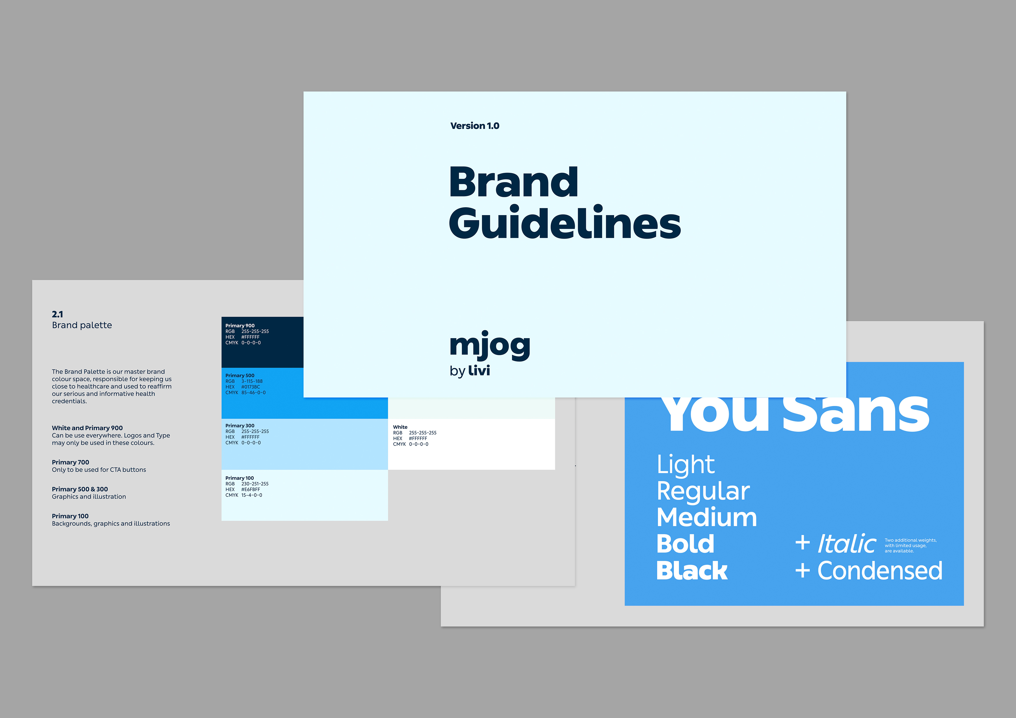
Mjog, a subsidiary of Livi (Kry.se), provides industry-leading healthcare software that empowers medical professionals to deliver the best possible patient outcomes. Despite its critical role in healthcare, the brand needed a visual identity that conveyed both trust and innovation, ensuring that medical professionals felt confident in its technology.
The challenge was to create a brand system that balanced medical credibility with approachability, ensuring that the software felt modern, user-friendly, and essential to healthcare providers.
The challenge was to create a brand system that balanced medical credibility with approachability, ensuring that the software felt modern, user-friendly, and essential to healthcare providers.

Ideation & Iteration
The challenge was to create a clear distinction between Mjog and Livi’s primary brand, ensuring Mjog’s individuality without going too far from Livi’s style. The design had to position Mjog as a trusted name in digital healthcare.
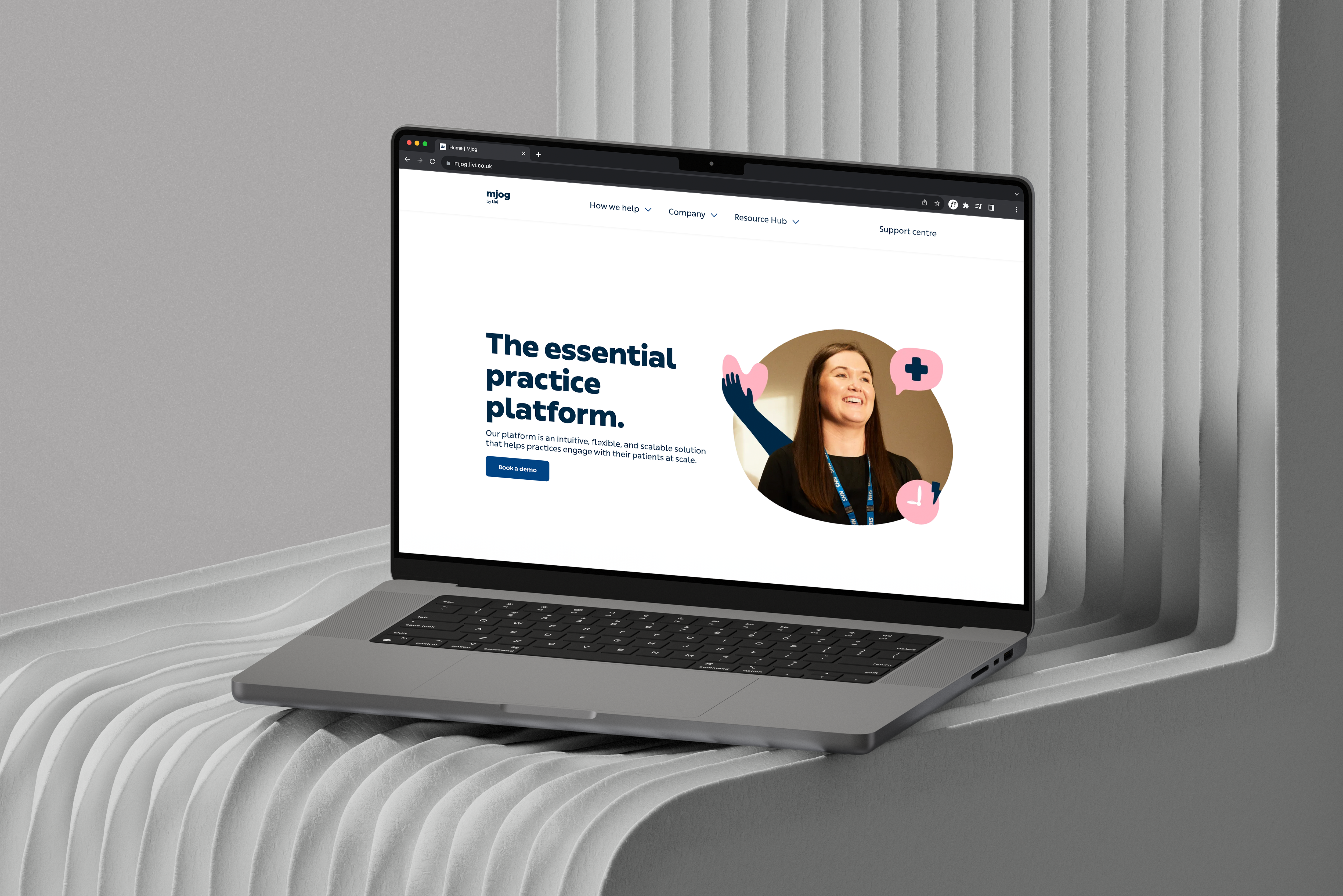
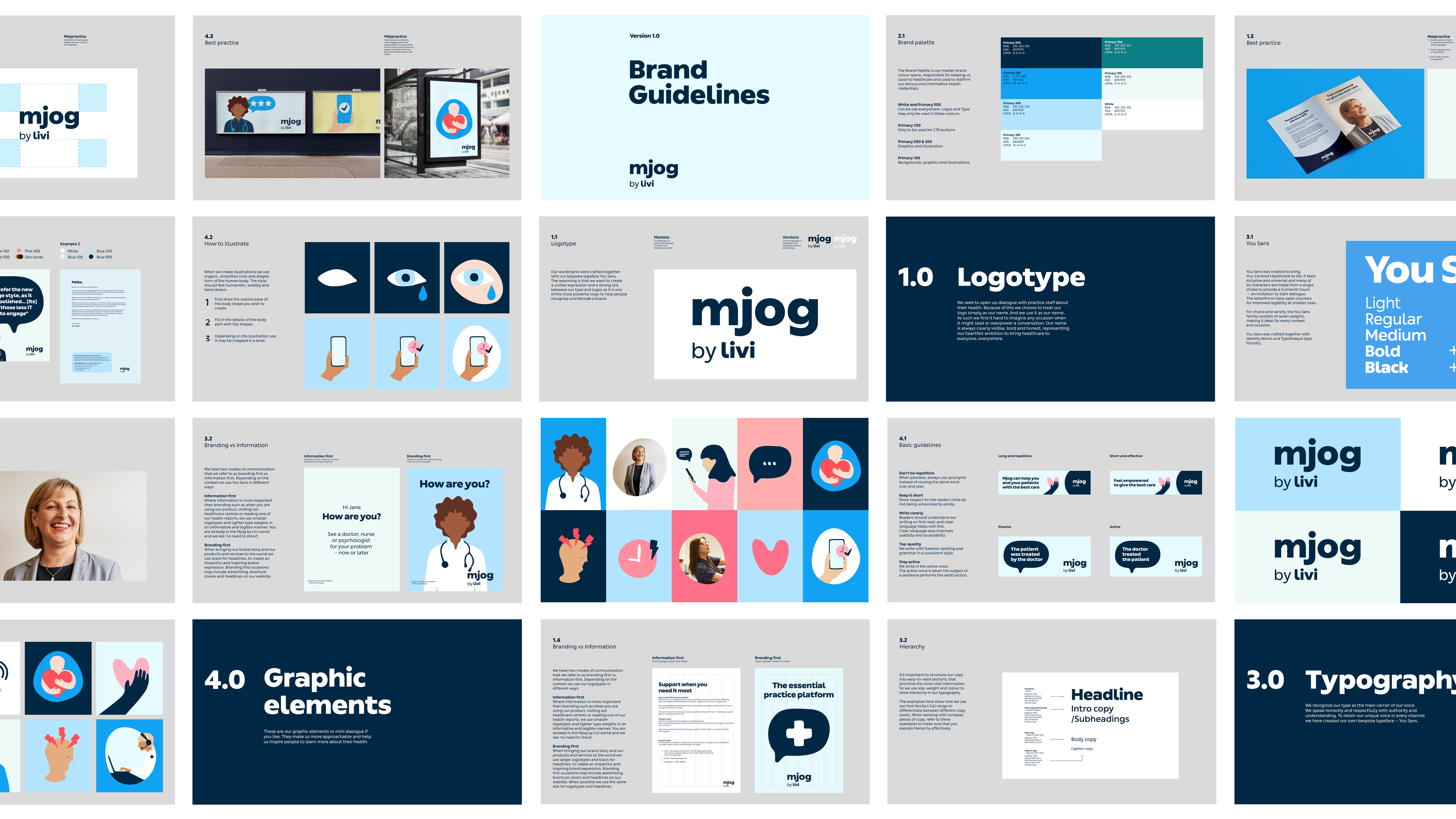
Starting with an audit of the existing brand, I identified areas needing refinement: inconsistent visuals, and unclear messaging. My goal was to align Mjog’s identity with Livi’s by introducing a unified tone of voice and a simplified, robust color palette.
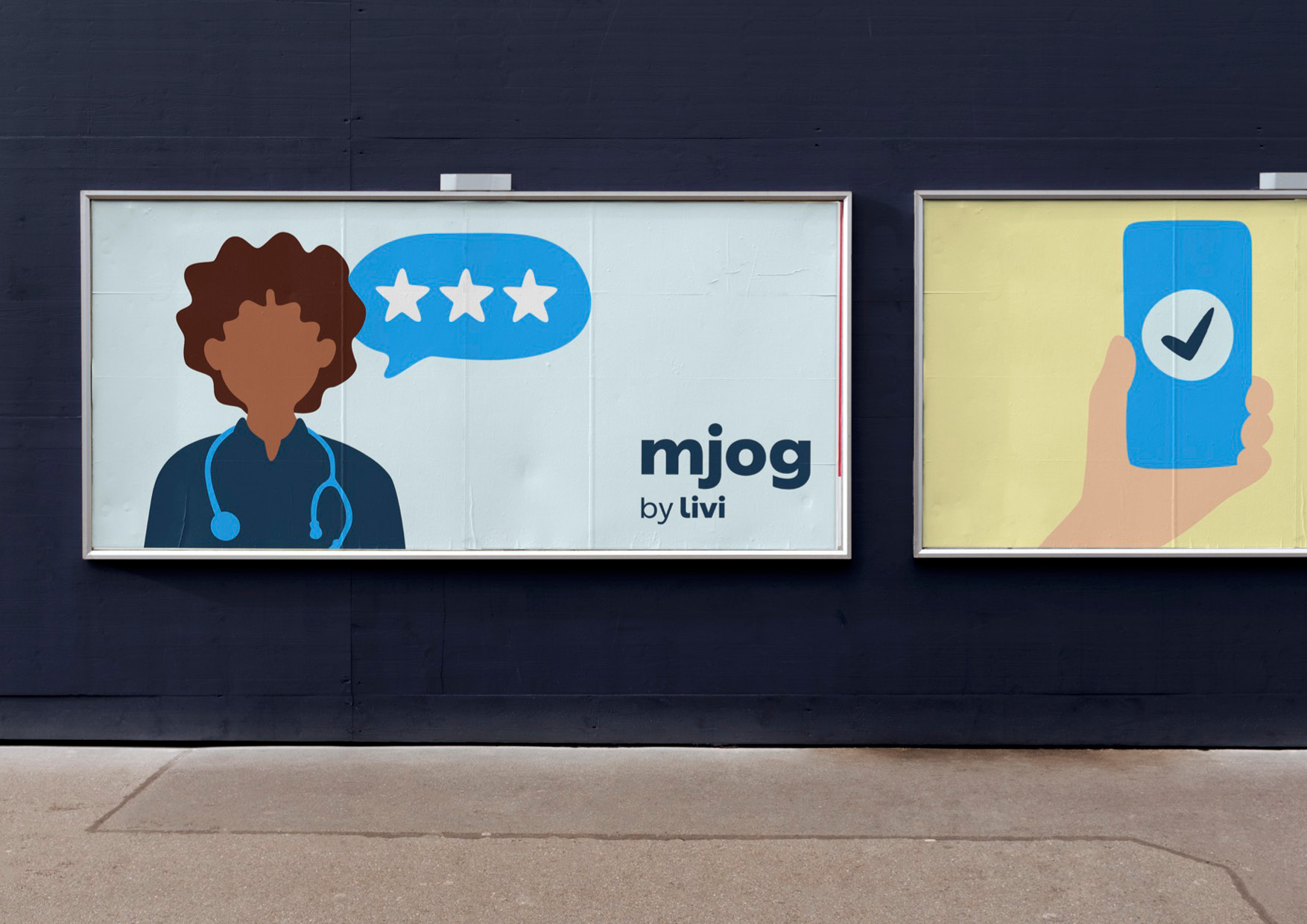
The redesigned Mjog brand now features a minimalist logo and fresh color scheme that convey professionalism. Visual elements, from icons to typography, are consistent and cohesive, building trust amongst users. This streamlined identity integrates seamlessly across digital channels, reinforcing Mjog’s credibility.
Moodboard ︎︎︎

Outcome
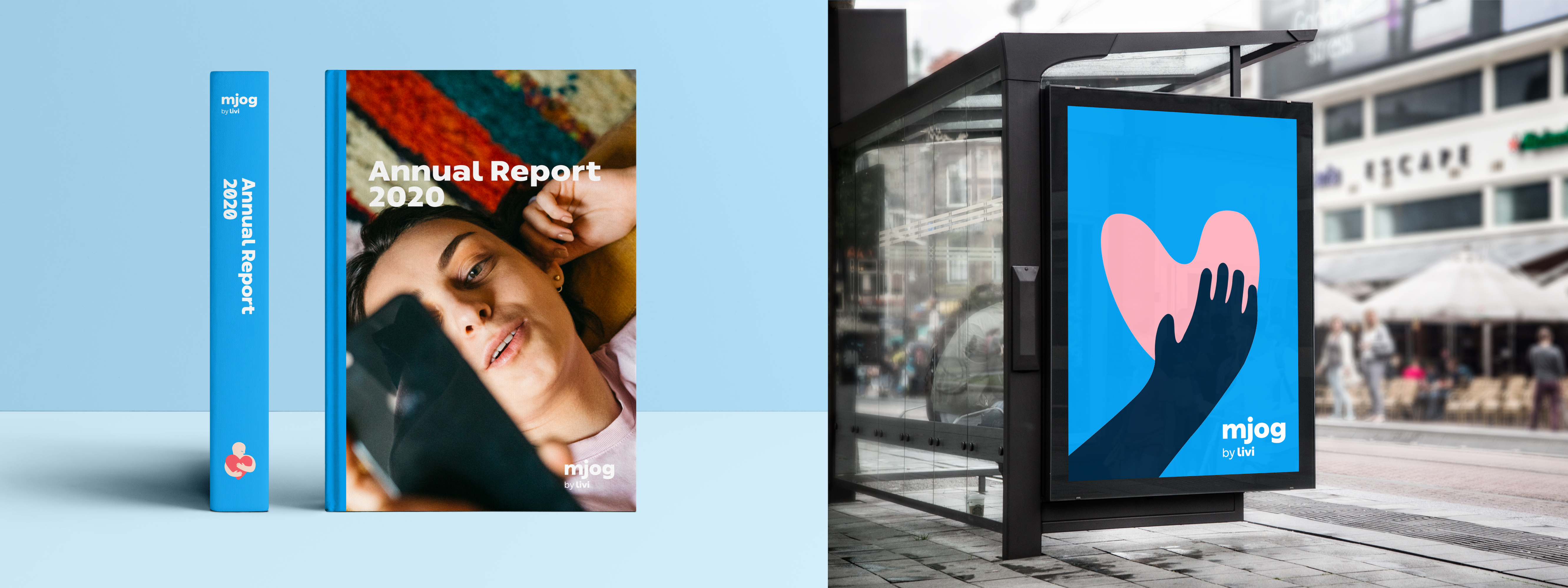
The modernized identity aligned Mjog more closely with its parent company, Livi, creating a cohesive brand ecosystem.
The updated brand design helped position Mjog as an industry leader, making it more recognizable and credible in healthcare technology.
This project reinforced the importance of branding in healthcare technology—a field where trust, clarity, and usability are paramount. The challenge was to balance scientific credibility with human-centered design, ensuring that both healthcare providers and patients could engage with the brand seamlessly.

Next project ︎︎︎