Isabella Fiori Case Study
Scope: Creative Direction / Visual identity /
Graphic Design
Graphic Design

About this Project
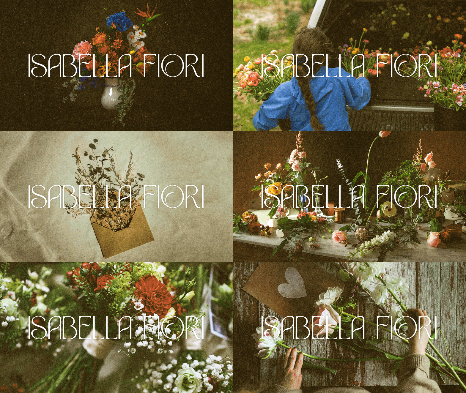
Isabella Fiori, a floral studio, sought to establish a cohesive and versatile brand identity. The goal was to design a modern yet timeless brand that would elevate their presence and attract a broader clientele.
Project Overview
The studio had no prior brand identity, making it essential to build a visual language from the ground up. The challenge was to craft a sophisticated yet adaptable identity that maintained a strong presence across digital, print, and physical applications. By focusing on their brand values, Joyful Artistry, Harmony, Elegance, Charm, and Natural Beauty, the new identity needed to communicate trust, luxury, and natural beauty while ensuring practical versatility.


Problem & Opportunities
With no existing visual identity, Isabella Fiori faced challenges in creating a recognizable brand presence. The lack of cohesive branding made it difficult to establish trust and appeal to a high-end clientele. This presented an opportunity to develop a refined brand system that could be seamlessly applied across multiple touchpoints, from packaging to digital platforms.d support a brand’s growth.
Research
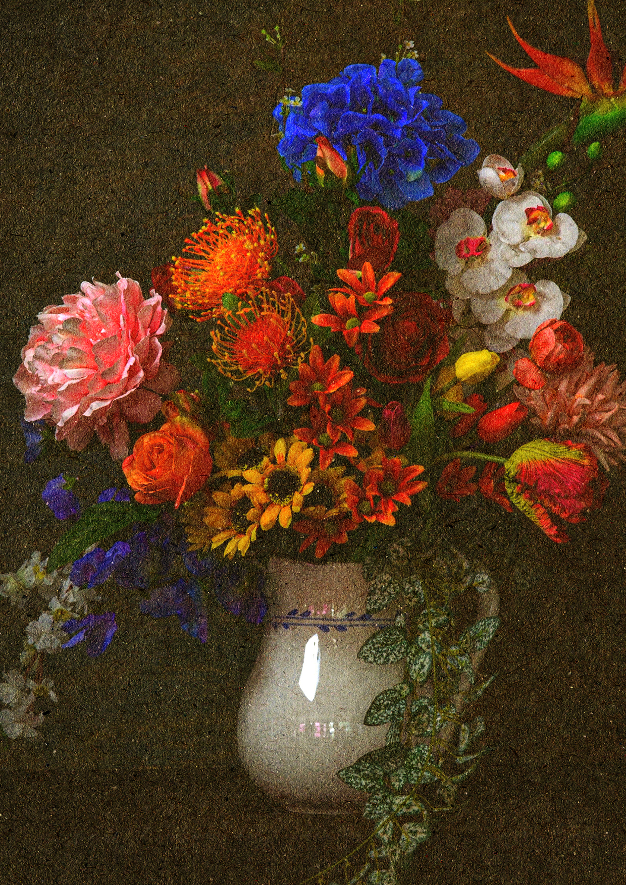
To align with Isabella Fiori’s values, I explored high-end floral studios, luxury branding trends, and nature-inspired aesthetics. By analyzing competitor branding and visual strategies, I identified key elements that exuded elegance and sophistication. The research emphasized the use of soft pastels and rich hues, refined serif typography, and minimalist design approaches that balance tradition with modernity.
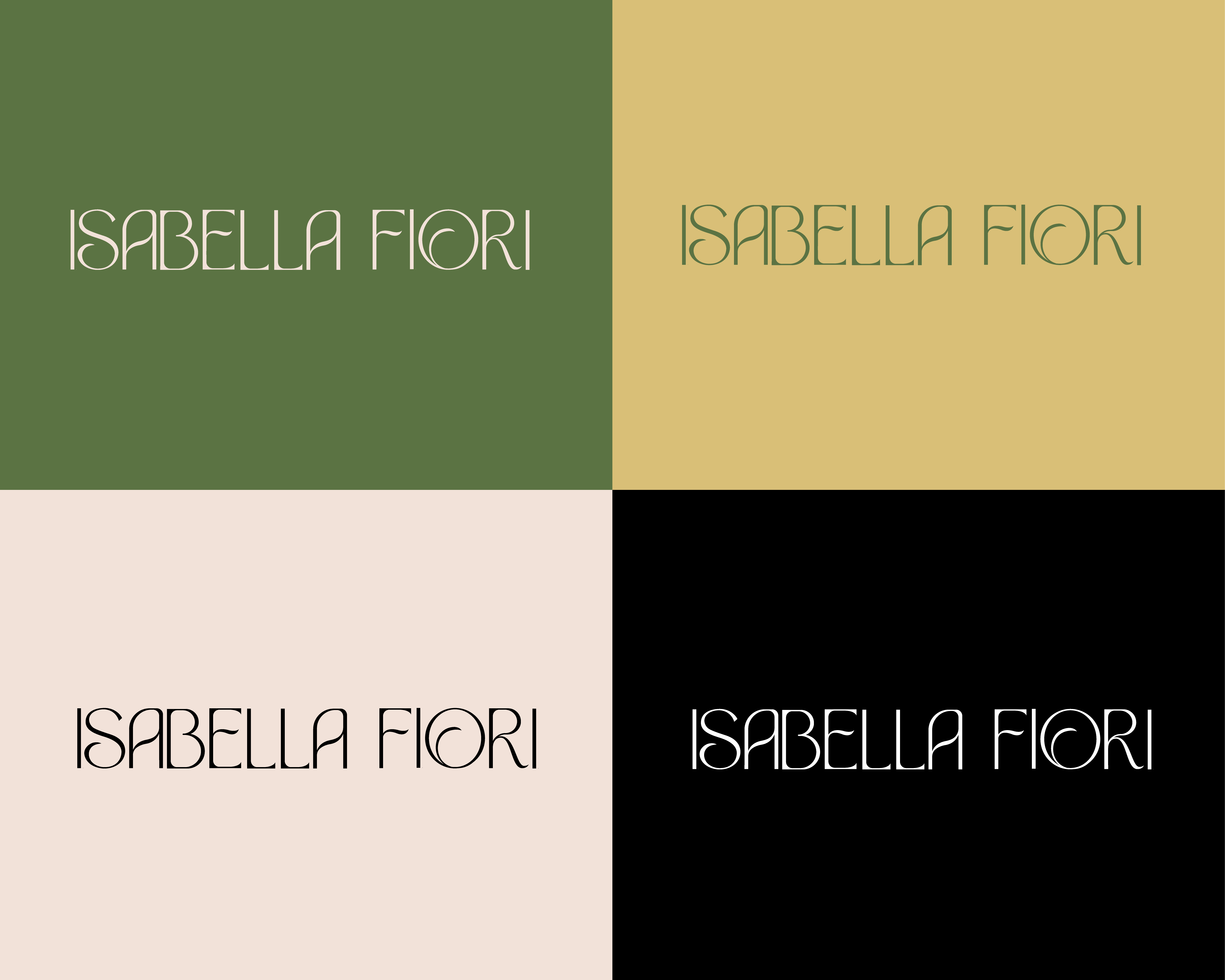
With that information in mind, I developed a brand framework centered on a nature-inspired color palette, combining soft pastels with vibrant hues. I paired this with an elegant serif typeface to ensure readability while maintaining a luxurious feel. The logo underwent multiple refinements to ensure adaptability across various formats, from social media to packaging. Testing different compositions helped maintain a balance between sophistication and functionality.
With that information in mind, I developed a brand framework centered on a nature-inspired color palette, combining soft pastels with vibrant hues. I paired this with an elegant serif typeface to ensure readability while maintaining a luxurious feel. The logo underwent multiple refinements to ensure adaptability across various formats, from social media to packaging. Testing different compositions helped maintain a balance between sophistication and functionality.

Final Outcome
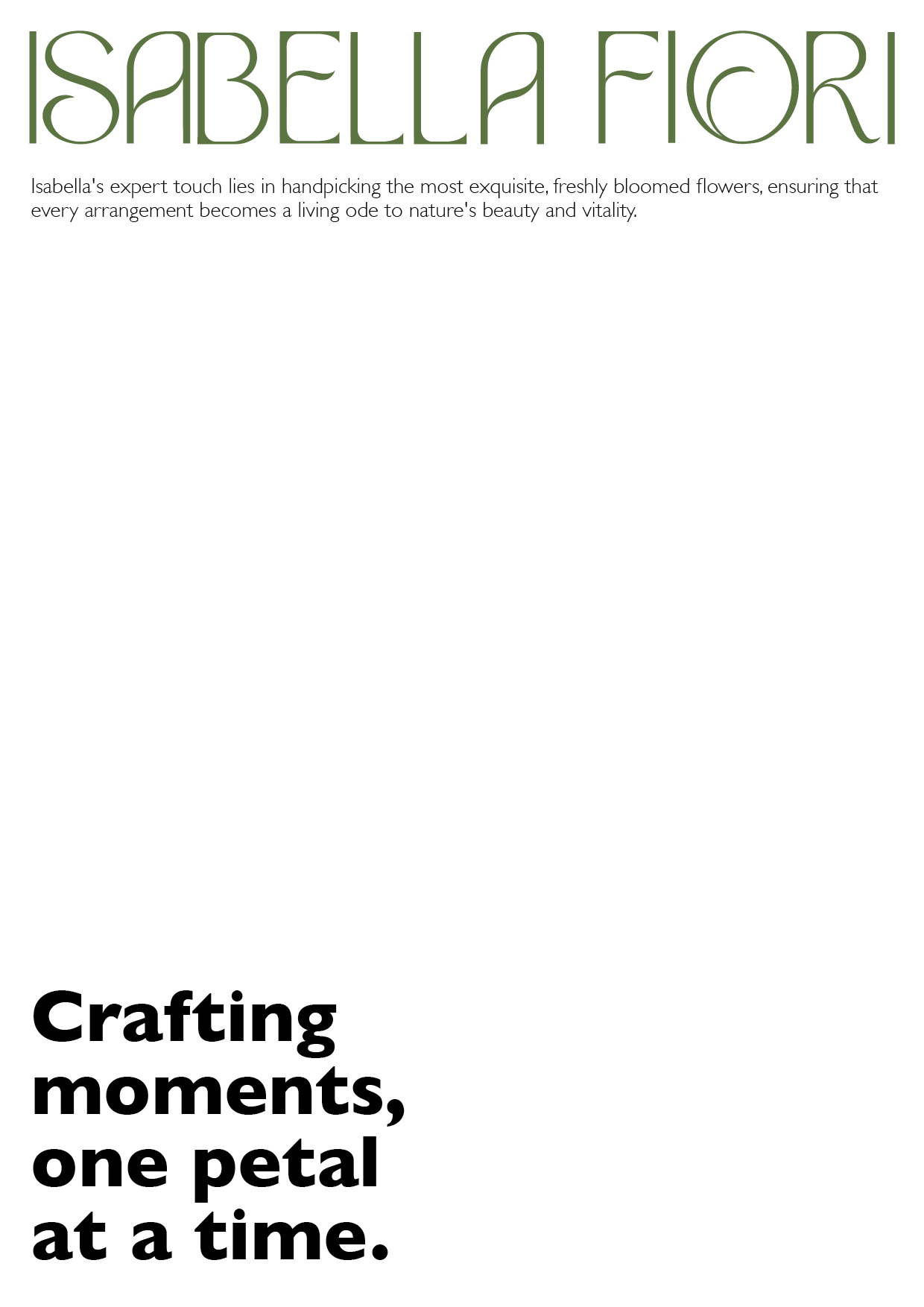
The final brand identity for Isabella Fiori includes a refined logo, an elegant serif typeface, and a soft yet sophisticated color palette. These elements create a cohesive and versatile visual system that reinforces the studio’s core values. The reworked logo maintains clarity and impact across various applications, enhancing brand recognition.
This project underscored the importance of a structured approach to branding, resulting in an adaptable, high-quality identity that resonates with Isabella Fiori’s audience and supports long-term growth.
This project underscored the importance of a structured approach to branding, resulting in an adaptable, high-quality identity that resonates with Isabella Fiori’s audience and supports long-term growth.


Next project ︎︎︎